Page widget: Custom#
Custom widgets are an experimental feature
The design of custom widgets is likely to evolve, and sometimes that will require updates to documents that use them. We won’t make such changes lightly.
The Custom widget allows a user to insert almost anything in their document. To create a custom widget currently requires knowledge of web development, and access to a public web server (for example, GitHub Pages).
A good use for custom widgets is to view records or tables in new ways. Using Grist as your data model and modern HTML/CSS/JS as your view is very powerful.
Minimal example#
To demonstrate to a web developer how custom widgets work, there is a minimal working example at:
https://public.getgrist.com/911KcgKA95oQ/Minimal-Custom-Widget/m/fork
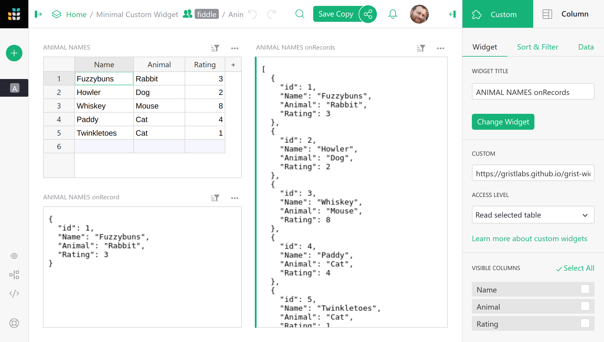
The example shows a table with some random data (names for pets), and two custom widgets, one showing the selected row in the table as JSON, and the other showing all rows of the table as JSON. If you change data in the table, or move the cursor, the custom widgets update as appropriate.
The source code for the widgets is at:
https://github.com/gristlabs/grist-widget/tree/master/inspect
It is stripped down to the essentials. Here is the full source code of the
onRecord widget that shows one row of data:
<!DOCTYPE html>
<html lang="en">
  <head>
    <meta charset="utf-8">
    <title>onRecord</title>
    <script src="https://docs.getgrist.com/grist-plugin-api.js"></script>
  </head>
  <body>
    <pre id="readout">Waiting for data...</pre>
    <script>
      grist.ready();
      grist.onRecord(function(record) {
        document.getElementById('readout').innerHTML = JSON.stringify(record, null, 2);
      });
    </script>
  </body>
</html>
The “Grist” parts of this are:
- Including
https://docs.getgrist.com/grist-plugin-api.jsto get the Grist API. - Calling
grist.readyto let Grist know the widget is ready to go. - Calling
grist.onRecordto subscribe to the current row of the table.
After that, everything else is regular HTML/CSS/JS. Once you have data coming in, you can render it any way you like, using React, Vue.js, or your favorite framework. For example, you could render records as a printable invoice, or use some obscure chart format that Grist doesn’t currently support.
Adding a custom widget#
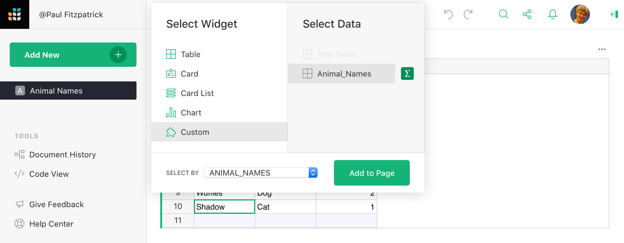
To add a custom widget that reads from a table, click on Add New,
then Add Widget to Page. Then:
- For
Select WidgetchooseCustomto get a Custom Widget. - For
Select Datachoose the table you want the widget to read data from. - Optionally, choose
Select Byto control the selected data further (read Linking Page Widgets for the possibilities).
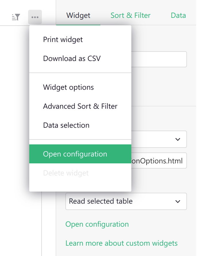
The custom widget is initially blank. To configure it, click the three-dots button on the top right of the custom widget, and select “Widget options”.
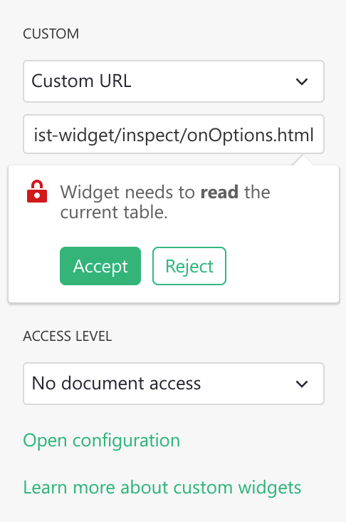
In the CUSTOM settings section where it says Enter Custom URL, put
the link to your custom widget. Here is a test widget to simply show table data
in JSON:
https://gristlabs.github.io/grist-widget/inspect/onRecords.html
And here’s one to show the selected row only (make sure “Select By” is set for the custom widget):
https://gristlabs.github.io/grist-widget/inspect/onRecord.html
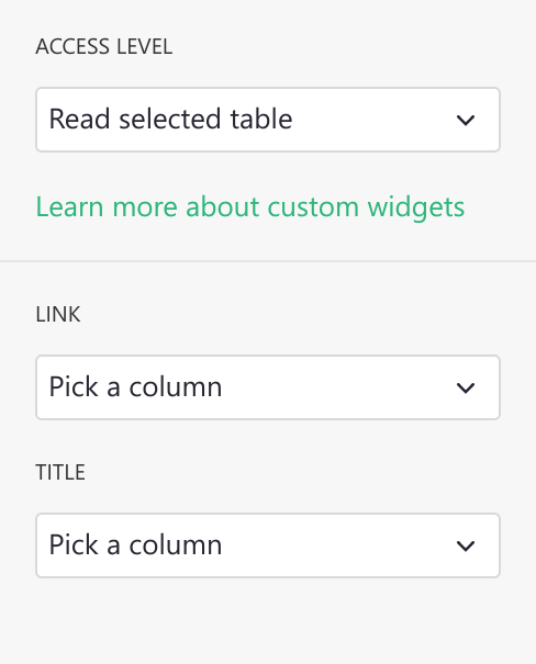
Access level#
When you put a link to a custom webpage it will be immediately rendered inside the section. Now you have the option to grant that webpage access to data in your document. The following access levels are available:
- No document access: the webpage is shown in the widget, but it has no access to the Grist document containing the widget.
- Read selected table: the webpage is shown in the widget, and is given read access to the table the widget is configured to select data from.
- Full document access: the webpage is shown in the widget, and has full access to read and modify the Grist document containing the widget.
The webpage should be owned and controlled by you or someone you
trust. With Read selected table permissions, a widget could send the
data it accesses to a third party. With Full document access permissions, a widget could
send all the document data to a third party, and modify your document in
any way.
We do not recommend using Full document access permissions at this time, since the API
for modifying the document is not yet stabilized. If you have
an urgent need, however, do contact us and request early access.
If you are writing your own custom widget you can specify what access level it needs as
part of the initial ready message. Possible values are: none, read table and
full.
<script>
  grist.ready({
    requiredAccess: 'read table'
  });
</script>
This directs Grist to request the desired access level from the user. Your widget will be reloaded with the appropriate access level if the user approves the request.
If you wish to get notified of the access level, you can subscribe to the onOptions
event that is sent to the widget after it tells Grist it is ready:
grist.onOptions(function(options, interaction) {
  console.log(interaction.access_level);
});
For now, just skip the options parameter (it will be described in
Widget options section). The current access level is part of
the second parameter, which describes how Grist will interact with your widget.
Invoice example#
The minimal example above showed records as plain JSON, but the widget can get as fancy as you like. Here is an example of showing a record as a printable invoice:
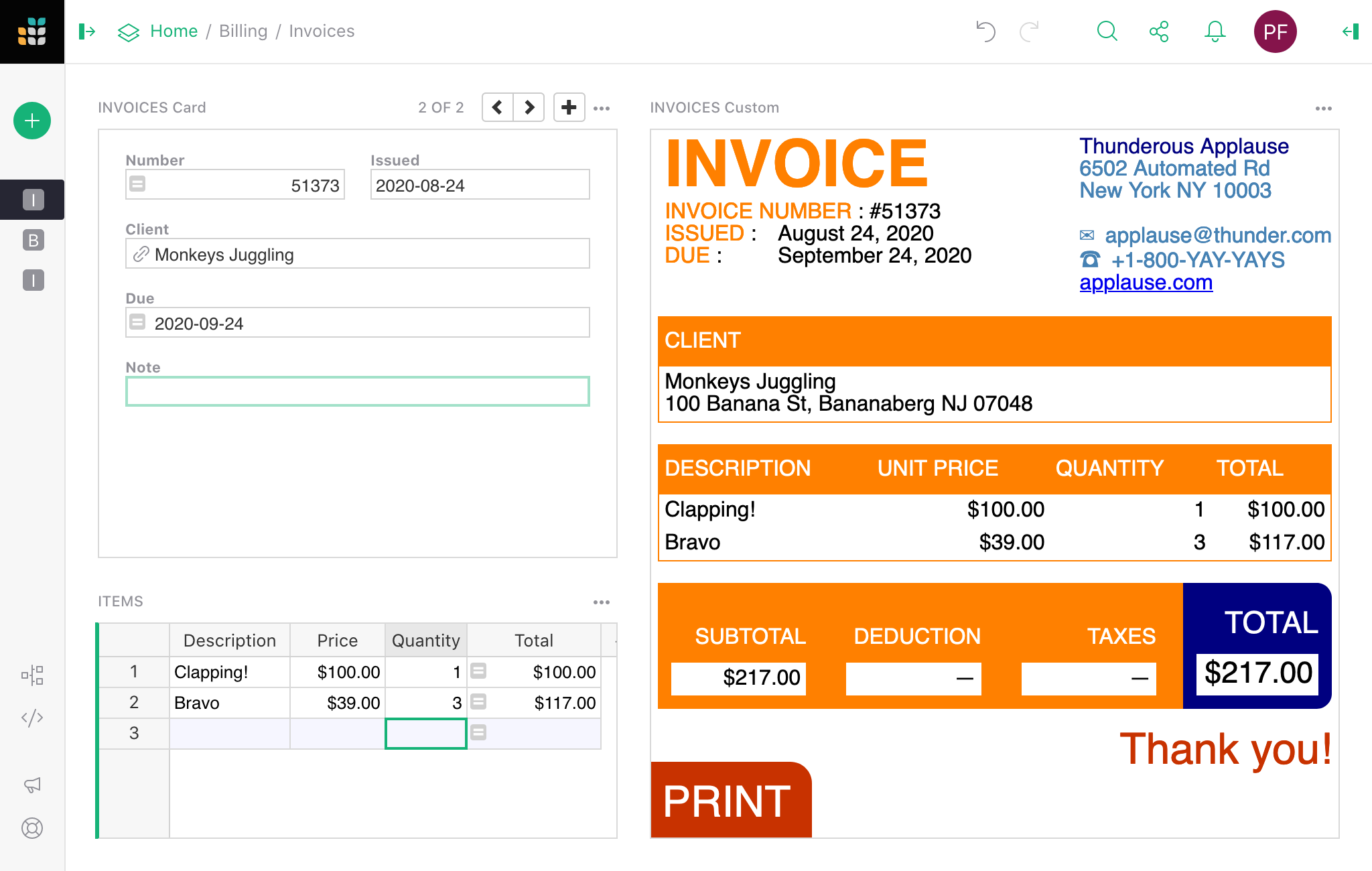
You can read the details of how to use this widget in our Invoice preparation example. The invoice widget is hosted at:
And the source HTML/CSS/JS can be browsed at:
https://github.com/gristlabs/grist-widget/tree/master/invoices
It uses Vue.js and grist.onRecord.
Creating a custom widget#
As you saw, writing a simple widget that uses data from a table is very easy. First, you
need to tell Grist that you are ready and then subscribe to one of the available events:
onRecord, onRecords or onOptions.
grist.ready();
grist.onRecord(function (record) {
  // Cursor has moved.
});
grist.onRecords(function (record) {
  // Data in the table has changed.
});
grist.onOptions(function (options, interaction) {
  // Configuration has changed.
});
Let’s say you want to build a custom widget that will show an image from a URL and
optionally a single line of text below as the image title. You will need to
read two values from two columns: Link and Title.
You could access those columns directly using literal column names in your script. Here is a complete example of widget source code that will do the job:
<script src="https://docs.getgrist.com/grist-plugin-api.js"></script>
<img id="image" src=""/>
<div id="title"></div>
<script>
  grist.ready({requiredAccess: 'read table'});
  grist.onRecord(function (record) {
    document.getElementById('image').src = record.Link;
    document.getElementById('title').innerText = record.Title;
  });
</script>
When getting started, this is a good approach, but it has two significant drawbacks. Every time you rename a column, you will also have to change your widget’s source. Moreover, using this widget on a different table or sharing it with your friends can be difficult as column names might be different. To help with this, Grist offers the column mapping API.
Column mapping#
Instead of using column names directly, you can ask the user to pick which column to use
as a Link and Title. The list of expected columns can be sent to Grist as part of the
ready call:
grist.ready({columns: ['Link', 'Title']});
Using this information, in the creator panel, Grist will hide the regular “Visible” columns section and display specialized column pickers.
Your widget will receive this mapping configuration as part of onRecord or onRecords
event in the second parameter. You can use this configuration to do the mappings yourself
or use the mapColumnNames helper function to do it for you.
<script src="https://docs.getgrist.com/grist-plugin-api.js"></script>
<img id="image" src=""/>
<div id="title"></div>
<script>
grist.ready({columns: ['Link', 'Title'], requiredAccess: 'read table'});
grist.onRecord(function (record, mappings) {
  const mapped = grist.mapColumnNames(record);
  // First check if all columns were mapped.
  if (mapped) {
    document.getElementById('image').src = mapped.Link;
    document.getElementById('title').innerText = mapped.Title;
    console.log(`Using ${mappings.Link} and ${mappings.Title} columns`);
  } else {
    // Helper returned a null value. It means that not all
    // required columns were mapped.
    console.error("Please map all columns");
  }
});
</script>
Now, if you rename one of the columns, the widget will still work. You can also use this widget in any other table or share with a friend, as it doesn’t depend on your table structure and can be easily configured.
In the configuration used above, we told Grist that all the columns are required, and the user can pick any column even if the column doesn’t contain a text value. To be more precise, we can include more options in the request. For example:
grist.ready({columns: [
  {
    name: "Link", // What field we will read.
    title: "Image link", // Friendly field name.
    optional: false, // Is this an optional field.
    type: "Text" // What type of column we expect.
  }
]});
The optional setting is important for correct operation of the mapColumnNames helper.
This helper will return a mapped record only when all required (not optional) columns are
picked.
By default Grist will allow the user to pick any type of column. To allow only a column of
a specific type, you need to set a type property. Here are all valid types:
Any, Int (Integer column), Numeric (Numeric column), Text, Date, DateTime,
Bool (Toggle column), Choice, ChoiceList, Ref (Reference column), RefList
(Reference List), Attachments.
Suppose the user deletes a column or changes its type so that it will no longer match the type requested by the widget. In that case, Grist will automatically remove this column from the mapping.
Widget options#
If your widget needs to store some options, Grist offers a simple key-value storage API for you to use. Here are some JavaScript code snippets that show how to interact with this API:
// Store a simple text value .
await grist.setOption('color', '#FF0000');

// Store complex objects as JSON.
await grist.setOption('settings', {lines: 10, skipFirst: true});

// Read previously saved option
const color = await grist.getOption('color');

// Clear all options.
await grist.clearOptions();

// Get and replace all options.
await grist.getOptions();
await grist.setOptions({...});
You can experiment with this yourself. Here is a test widget that demonstrates how to use this API:
https://gristlabs.github.io/grist-widget/inspect/onOptions.html
When your widget saves or edits some options, the icon on top of the section gets highlighted in green. You can either apply those options to the widget or revert that modification.
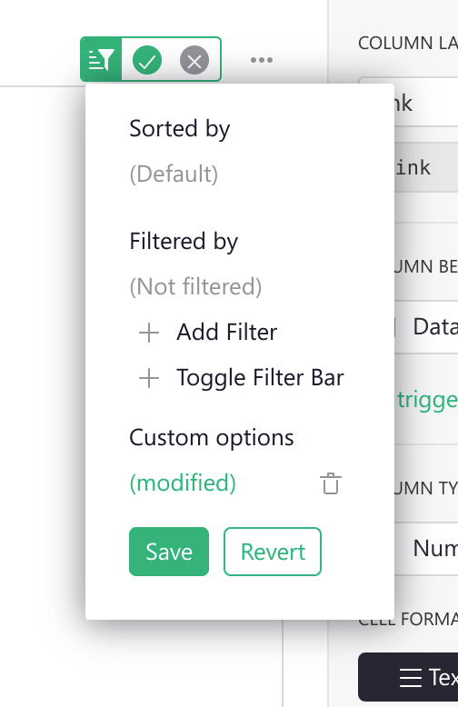
This allows viewers (users with read-only access) or collaborators to configure your widget without overwriting original settings. This behavior should look familiar to you and others, as this works like sorting and filtering on table or card views.
Saving current options you will apply them to the widget and make them available to
others. Using this menu, you can also clear all options to revert the widget to its
initial state. To do this, press the little trash icon and then Save.
Grist will also trigger an event, every time the options are changed (or cleared). Here is how you can subscribe to this event.
grist.onOptions(function(options, interaction) {
  if (options) {
    console.log('Current color', options.color);
  } else {
    // No widget options were saved, fallback to default ones.
  }
});
If you are building your own widget, you generally should not read options directly (using
grist.widgetApi.getOption()). A better pattern is to apply them all when they are
changed. Using the onOptions handler will make your widget easier to change and
understand later.
There is one more scenario to cover. Suppose your widget has some kind of custom configuration screen. In that case, you probably need some button or other UI element that the user can use to show it. This additional UI element will likely be rarely used by you or your collaborators, so it doesn’t make sense to show it all the time. To help with this, Grist offers an additional interaction option you can send as part of the ready message:
grist.ready({
  onEditOptions: function() {
    // Your custom logic to open the custom configuration screen.
  }
});
This will tell Grist to display an additional button Open configuration in the creator
panel and the section menu. When clicked, it will trigger your handler, which you can use
to show your own custom configuration screen.